Thursday, November 30, 2006

Another Chance to Wonder


No doubt most of you reading EPCOT Central are aware of this, but Disney has announced that the Wonders of Life pavilion will be open “seasonally” during the holidays.

While I’d love to applaud Disney for this effort, the fact is that there’s no good reason for the pavilion to be closed in the first place.

When Disney makes billions off of the sale of its media assets, as it recently did, and can rake in hundreds of millions of dollars in profit from its movie business, there’s no logical business reason that it can’t fund the refurbishment and maintenance of its theme-park attractions itself, absent a corporate sponsor.

Although MetLife long ago pulled its sponsorship of the Wonders of Life pavilion (thereby removing the Peanuts characters from Walt Disney World!), Disney’s decision to completely shutter the pavilion was a lunkheaded move that spoke volumes about its commitment to its theme-park business. Letting a major component of Epcot fall by the wayside, claiming that operational costs needed to be shared by a sponsor, should serve as a rather alarming indication that Disney is not particularly committed to the creative health and long-term quality of its parks, only to the assurance that it will realize as much profit from quarter to quarter as possible.

I’m thrilled that guests will have the opportunity this winter to experience the Wonders of Life. However, it will be in a “stripped down” version, with the food-service and stage areas of the pavilion closed off. And, of course, it will be in the shape it was in when it closed – relatively uncared-for, with attractions that feel rooted in the 1980s.

Nonetheless, Wonders of Life is a pavilion that is essential to the thematic success of Epcot’s Future World. While other pavilions explore the world around us, Wonders of Life explores the world within.

As we learn more about (and experiment more with) genetics, biotechnology and human health, there would hardly be a better time to update the Wonders of Life with exhibits and shows that demonstrate how much there is left to learn about the way humans work – and how we are making discoveries every day.

Pick up any recent copy of Time or Newsweek magazine and you’ll see how far health issues have moved into the “mainstream.” The Wonders of Life has the opportunity to bring today’s ever-evolving issues into the minds of guests at Epcot – it’s a fantastic opportunity that is sad to think may be wasted by Disney’s corporate mindset.

If you do visit the Wonders of Life this winter, be sure to write to Walt Disney World at wdw.guest.communications@disneyworld.com and let them know how much you value the pavilion, even if Disney itself does not!

Sunday, November 19, 2006

A Simple Spaceship

Photo illustration created by and courtesy of Werner Weiss, www.yesterland.com

The fantastic Disney-fan website Yesterland, which is home to an impressive array of essays and photos of Disney attractions (mostly at Disneyland) that no longer exist, has been bit by the Epcot "what-if" bug.

Yesterland curator Werner Weiss has demonstrated impressive Photoshop abilities by reminding visitors how much worse it could get with the "dressing up" of Spaceship Earth. Spaceship Stitch, anyone? Capt. Jack Sphere-ow?

His imaginings are both hilarious and a bit scary -- if the wrong folks at Disney (so many of whom seem to have such a poor sense of humor) get a hold of these parodies, they could come to think of them as "conceptual designs," and might start getting ideas.

If they do, they'll hopefully spend most of their time looking at the final image on Werner's Spaceship Earth page. There, they'll find (reprinted above, with Werner's kind permission) the best possible concept of all:

Nothing.

No hand, arm, no wand, no stars, no curlicue "Epcot" -- just the 180-foot-tall geosphere of Spaceship Earth against a beautiful Florida sky ... "naked" and proud.

Werner's Photoshopped image leaves in the garish mauve awnings (what are they for? It can't be shade, as they provide little) that rise above Innoventions Plaza, and it's most interesting to note how they detract from the overall scale of an unadorned Spaceship Earth. Not that that's a reason to leave up the hand and wand, mind you! And not that today's Imagineers seem to care much about a sense of scale (see the Sorcerer's Hat at Disney-MGM Studios -- this link takes a minute to load, but it's worth it! While you're at it, check this out for an excellent proposal on what to do with the hat.).

It's a lovely image to consider ... Spaceship Earth, restored to the way it was meant to be. How many people, even wand supporters (if you're out there), can look at the image at the top of this article and think the wand should stay?

Saturday, November 18, 2006

Why It Matters


I received this comment from a reader via e-mail:

"Future World in EPCOT Center inspired me to become an engineer, and the Energy Exchange in Communicore encouraged me to pursue nuclear power."

Wow.

How much more proof do you need that EPCOT Center mattered, and that the problems of today's Epcot are worth "whining" about?

The old saw says that if you can reach just one person, you've succeeded. So, there's proof. I welcome any of you who were equally inspired in any way by EPCOT Center to let me know. (For what it's worth, I was inspired to my own profession by Spaceship Earth and the story it told of the power and meaning of human communication.)

I can't think of many places in the world -- many, I wrote, not any! -- that could inspire young people the way EPCOT Center could. Did it also inspire adults? I don't know, possibly; but the cynicsm of adulthood could easily get in the way. For young people, EPCOT Center represented everything that lay ahead of them, everything that they had a chance to make real -- whether it was new technology, new ways to work and think, or the possibility of traveling the world and bridging cultures.

It's hard to imagine many people being terribly inspired by today's Epcot. Or, worse, that Disney even considers itself to be in the "inspiration" business anymore.

Thursday, November 16, 2006

'The Hopes of Progress'


While reading the novel Saturday by Ian McEwan, I ran across this passage I wanted to share. Take from it what you will, but it seemed very relevant to the ongoing discussion of why Epcot has sunk so low and what it means about the "creative" minds at Disney. The bold highlight is mine:

He remembers some lines from Medawar, a man he admires [note: the reference is to Peter Medawar, 1960 Nobel Prize winner in Physiology and Medicine]: "To deride the hopes of progress is the ultimate fatuity, the last word in poverty of spirit and meanness of mind." ...

"But if the present dispensation is wiped out now, the future will look back on us as gods, certainly in this city, lucky gods blessed by supermarket cornucopias, torrents of accessible information, warm clothes that weigh nothing, extended life-spans, wondrous machines. This is an age of wondrous machines. Whole music libraries held in an object the size of a child's hand. Cameras that can beam their snapshots around the world. Effortlessly, he ordered up the contraption he's riding in now through a evice on his desk via the Internet. The computer-guided stereotactic array he used yesterday has transformed the way he does biopsies. Digtialised
[sic] entertainment binds [a] couple walking hand in hand, listening through a Y-socket to their personal stereo."

I read this passage and wondered ... where is our generation’s celebration of our world, our life? Isn't that, at its core, what EPCOT Center was and why it worked so well?

It reminded us of how much we had to be happy about, and how much happiness and improvement to our lives was still to come. It reminded us of who we were at that time, how fortunate we were to live in that time – and every once in a while chastised us very lightly for not doing more to be even more interested in our world.

It wasn't about princesses and caballeros and cartoon clownfish singing songs and imploring you to be happy and irritate your parents.

That's why I'm so disappointed: As a result of its changes, Epcot itself has begun (intentionally or by accident?) “to deride the hopes of progress” – to present exactly the wrong subconscious and contextual messages than it was intended to offer.

And, by extension, these changes to Epcot have shed light on what Disney itself has become – a country that values quick financial results over the long-term continued growth and expansion of its creative side; an organization that, for all the "happiness" it claims to offer, has developed a terrible and quite real “poverty of spirit and meanness of mind.”

It’s my hope that EPCOT will one day begin to celebrate again, to champion and proclaim the future and the world around us as worthy of optimism, of moving toward continuous and never-ending progress.

Some may believe that's a silly and naive goal (you have made yourself very clear in your e-mails), but I think it remains a noble cause, one that not only reaps accretive – but substantial – economic rewards for the company but also even greater intangible rewards such as motivating and inspiring new generations to believe in something much more than simple commercialism. For even in its previous, sponsor-heavy incarnation, the messages that came across most clearly were that people were thinking about, working on and creating a better world, not simply that our future would be brought to us by AT&T, Exxon and United Technologies.

EPCOT Center was magnanimous in spirit, was kind and gentle of nature, was of an inspiring, active and enviable mind. Those are not words that even the most lenient among us who care about this place would say about Epcot.

Where is the spirit of the old EPCOT? Can it be rescued? I hope so ... because , to steal a line from the old That's Entertainment, boy, do we need it now.

The future, as it existed in 1982, looks back kindly on EPCOT Center, not because it was perfect, but because it tried, and that in and of itself was admirable and wonderful.

The future of 2006, I am afraid, will not look back so kindly on Epcot nor on the Walt Disney Company that steadily and (I believe, more and more) quite intentionally oversaw the destruction of a cultural institution that existed so well, so lovingly, for nearly a century.

******************************************

Postscript (Nov. 17, 2006): I did a bit more research into the speech that Peter Medawar gave in 1969 that contains the line quoted above. It is an incredibly rich, difficult speech to read, but for anyone interested in his observations on society and progress -- honestly, for anyone seriously interested in why EPCOT Center proved to be so much more than many people perceived and why its recent failings are so monumentally disappointing -- Medawar's speech is really remarkable and highly recommended. He may have given the speech 37 years ago, but it remains extraordinarily relevant.

Wednesday, November 15, 2006

Sign o' the Times?


Thanks to Epcotrob for this great Photoshop creation that pretty much says what's on many of our minds!

Tuesday, November 14, 2006

Mexico, Schmexico -- They're All Latin!


That's what Disney seems to be thinking when it comes to a renovation of the Rio del Tiempo ride in the Mexico pavilion.

Word is out that Disney is planning a refurbishment, and the long-rumored plan is for Imagineers to base an updated ride on the 1944 Disney animated movie The Three Caballeros.

There's just one little problem: Only one of the three caballeros is actually Mexican, and a good chunk of the movie takes place in Brazil.

The movie was designed to promote good relations with all South American countries. To base a Mexican ride on a project that was inherently Latin but not specifically Mexican is to thumb a corporate nose at understanding what makes each Latin-American country unique. It's a shame to think Disney might stoop to this level just to introduce still more animated characters into Epcot ... a move that the more cynical among us might imagine to be aimed at selling more merchandise, not at actually improving the ride.

Mexico is a beautiful country with a remarkably rich culture that goes all the way back to ancient times. To even imply that a ride aimed at showing off that culture and heritage can be "improved" by adding in some cartoon birds (sorry, Donald, Jose and Panchito, but let's call a bird a bird!) is to ignore the thousands of years of progress and contribution that Mexico has made.

The Rio del Tiempo refurbishment is an opportunity for Imagineers and Disney's park management to show they understand what makes Epcot so special and what it needs to return to its former glory.

Let's hope this rumor is really a rumor, and that Disney won't cheapen Mexico's history and people by adding in some funny cartoons and making yet more Americans and Europeans think that all Latin countries are essentially the same.

Thursday, November 09, 2006

A View of Horizons


While this video may not be perfect ... I can almost smell the oranges!

This is a great way to remember why Horizons was such a terrific, entertaining addition to EPCOT Center, and is also an excellent reminder of what we miss when Disney insists on filling its theme parks with thrill rides instead of the immersive, creative, ambitious entertainment at which it used to excel.

As in the video I posted earlier that features Spaceship Earth, it's also interesting to note how smooth and animated the AA figures are when they're new and/or properly maintained!

So, click on the video image above and travel back to Futureport ... and get ready for a fun, sentimental journey into a future that probably never would have been, but now, sadly, never can be.

(And while you're at it, try clicking on the link to the Horizons tribute site on the right side of this page. Not only does it present some great photos and music ... but there's a nice little description at the end of the webpage that details just how prescient Imagineers were in what they presented in the Horzions attraction. Maybe this vision of the future wasn't so far-fetched after all ... or, even better, perhaps some young engineers were inspired 20 years ago by what they saw at EPCOT Center.)

Saturday, November 04, 2006

16 Suggestions for Fixing EPCOT


I had thought that many of the signs of Epcot’s continued decline that I witnessed during my recent vacation were temporary. Sadly, they appear not to be, based on a report over at Miceage.com.

It doesn’t have to be this way. Disney does not need to invest tens of millions of dollars into whipping Epcot back into shape. As EPCOT Center (and the lower-cased Epcot) prepares to celebrate its 25th anniversary, there are some ways Disney could show good faith in what used to be its crowning theme-park achievement.

Below are 16 suggestions I have that don’t require massive capital-intensive investment … or, frankly, even a whole heck of a lot of work, for the most part. No doubt, you can think of more!

1) Leave the Legacy
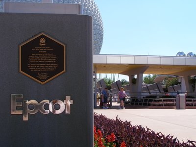
First impressions count, and the first impression guests get at Epcot these days is one of blank granite walls. It makes for a great kitchen-counter showroom or government-designed war memorial, but the whole concept of “Leave a Legacy” has been, let’s face facts, a failure. There’s supposedly room for 750,000 images, but only a small fraction of that have been installed six years after the concept was introduced. Disney’s own website has essentially given up on the “Legacy” idea, and it’s time Epcot did the same. My suggestion: remove the image plaques and create beautiful etched images that tell the story of man. Make this a sculpture people want to look at and admire. Add some additional water or flower elements to the area. It may be too costly and impractical to remove the “gravestones,” but they certainly could be improved visually, and bravely admitting that the “Leave a Legacy” idea was a failure would mean that the incredibly ugly kiosk at the base of Spaceship Earth could also be removed.

2) Vacate the Vacation Club
The hideous purple kiosk that touts the Disney Vacation Club is just one of scores of sales-pitch stops that guests encounter throughout the parks, resorts and recreation sites at Walt Disney World. Enough is enough, particularly in Epcot’s Future World and World Showcase. Open a permanent Vacation Club information center in one or two of the old, never-used ticket booths at Epcot’s main gate if this timeshare sales pitch is absolutely imperative … but, please, you’ve already taken several hundred of my hard-saved vacation dollars from me when I entered, do you really need to keep insisting I spend more? And does such a sales pitch belong inside the park? Imagine sitting in a movie theater and having the show interrupted with an ad to buy snacks. If the parks are living movies, then that’s exactly what these blatant sales come-ons feel like. They seem out of place at all of the parks, but particularly at Epcot.

3) Off the Outdoor
A few well-placed outdoor-vending carts are always going to be welcome sites, whether a guest is in the mood for a cold drink, some ice cream or a quick roll of film. But outdoor vending has gone haywire throughout Epcot; on my most recent visit, World Showcase was lined with carts. Epcot is beginning to resemble a flea market, and that’s just not necessary. I don’t need to buy tacky necklaces made of “light,” knock-off lightsabers or bizarre machines that make string do weird things under black light. These items and the way they’re sold make me feel like I’m at a cheap state fair, and selling them is one of the ultimate signs that Disney will do anything to turn a buck, even have cast members stand around like sideshow barkers. One of the real joys of Epcot is shopping in World Showcase and discovering items you’d never find back home. Keep the outdoor vending to a minimum (really, what more is needed besides a few key snacks and some beverages?) and let us go inside to buy our souvenirs.

4) Ban the Ball
While we’re on the subject of outdoor vending, you know those “Ballzac” things that take up space in the breezeways between Innovations Plaza and Future World’s east and west sides? Get rid of them. In all my years of visiting Epcot, I’ve never seen a single guest actually purchase one of these (though, I reckon, they must, since they’re still sold), but I have seen guests play an unwelcome game of dodgeball when a bored cast member banished to the lowly post of selling these “fun” items decides to have a little fun. They’re obnoxious; they have nothing to do with Epcot’s sense of fun, futurism or discovery; and they just clutter the place up. I have strong doubts that Epcot’s per-guest spending rate would drop dramatically with the elimination of the utterly incongruous “Ballzac” junk.

5) Fix the Films
It’s a travesty to see a beautifully produced (if awfully outdated) film attraction like Impressions de France look like a travelogue that’s been touring the country for decades. Scratched, dirty, out of focus and out of alignment, it’s just one of the movies that Epcot’s management really needs to fix. That doesn’t mean that WDI needs to go out and spend millions to produce all-new movies (though it can’t cost that much, relatively speaking, to re-do these every five years or so – certainly less than the $250 million or more that the company will spend on Pirates of the Caribbean 3). Strike new prints, install them correctly, update the projection equipment and show off these still astonishingly gorgeous and beautifully produced movies properly. They’re classy; the way Disney has treated them is anything but.
Fix #7: Save the Signage


Fix #6: Shine Up the Shops

6) Shine Up the Shops
MouseGear was filled with broken fixtures and endcaps on my last visit. Top shelves in some stores actually showed dust. Particularly in Future World, the retail locations look tired and unappealing. Frankly, some of the stores are beginning to get a creepy Six Flags vibe, and that’s just not good. Bring some showmanship back to the stores. If Disney’s “centralized” merchandising group doesn’t see fit any longer to create fun, unique items for individual theme parks (much less Resorts, based on the Disneyland/Walt Disney World merchandise that is increasingly common), at least show off the wares with some flair. Pay particular attention to the stores in Future World, which are increasingly threadbare and look more and more like the Woolworth’s down the street … just before it closed.

7) Save the Signage
Throughout Future World, particularly, the directional signs look sad and neglected. Instead of really showing us the way or imparting information, they just sit there with names of attractions blanked out looking dirty and kind of gross. The signage throughout Epcot is another example of how exactly the thing Walt Disney wanted to avoid – cheap, vaguely dirty carnival-style parks – is exactly the outcome of the management techniques Disney has put in place in the past decade or so. In my collection of old Disney News magazines is an article from the early 1980s describing the meticulous care Disney’s designers put into the signage. These days at Epcot, fonts and colors don’t always match, the signs barely point us in the right direction, and some of them look like they haven’t been touched in almost the entire 25 years Epcot has been in existence. Pay attention to little details like this … and guests will notice! (Frankly, the old signs, with the stylized circular logos for each pavilion and the names of countries in script that recalled their cultures, were a lot better looking.)

Fix #16: Whack the Wand

Fix #8: Deep-Six the Sales

8) Deep Six the Sales
In the area originally called “World Showcase Plaza,” one of the two large retail buildings is being used for … a fire sale. Tacky signs with Mickey Mouse hands and a crappy cartoon font script scream out, “We couldn’t get rid of this stuff anywhere else, so come get it cheap!” That’s not really what they say, of course, but it might as well be. To use prime real estate for what is essentially an outlet store is horrible show and a terrible management decision. If I can get stuff here for less than 10 bucks, why should I pay full price somewhere else? In today’s Wal-Mart world, that’s bound to be the message guests take away from this retail reduction. It’s just a lousy idea, and should be axed.

9) Adjust the AAs
As a recently posted old video montage of EPCOT Center shows, the Audio-Animatronic figures in Spaceship Earth, Universe of Energy and The American Adventure used to look so much more animated. Give these guys some TLC, show us what makes AA figures so cool. Lube ’em up, or whatever you call it, but put some life back into them. Give us more of what makes Disney so uniquely Disney … and that does not mean recordings of Stitch and appearances by Mickey and Minnie – it means the technology and creativity that sets Disney apart from any other theme-park operator in the world. AA figures are a huge part of that, and EPCOT Center had more of them than any other park. They made EPCOT special, and can do it again.

10) Acknowledge the American Diet
Now, I love hamburgers, hot dogs and French fries as much as the next guy, but they do not define my diet – not by a long shot. In my extensive travels throughout the U.S., I’ve had extraordinary local cuisine, from Seattle to Miami, from Boston to Kansas City. Certainly there must be a more creative and honest way to represent American food than a fast-food joint? Show some flair when it comes to showing off the dining options in the “home country” by offering something more than fast food at the American pavilion.

11) Nurture the Norway Pavilion
I’ve already written about my extreme disappointment in the way the Norway pavilion has been treated, and I don’t need to go into more detail here. But, come on! Show Norway a little respect. It’s one of the few countries represented in World Showcase (along with China and Morocco) that are out of reach for most American tourists. Though its customs and culture may seem familiar, they’re quite unique, and deserve much more than they’re getting. At the very least, bring back a non-Princess Akershus for the dinner meal, if nothing else.

12) Enliven the Exits
Guests who experience the epic (in length, at least) Universe of Energy and immersive Spaceship Earth deserve much more upon exiting than empty rooms. Granted, it seems that Siemens will be upgrading the old Earth Station/Global Neighborhood in the near future, but when Exxon dropped its sponsorship of Energy, was it necessary to just shutter up the exit area? Inexpensive displays that explain some of the concepts we’ve just seen would be a welcome addition, a way for guests to feel they’re not being unceremoniously dumped into a far corner of Future World upon the ride’s completion. Likewise, the exit of Mission: Space is nothing but a series of blank hallways. Couldn’t Imagineers at least add some nice wall displays to enlighten us a bit more on space travel? After experiencing (and surviving!) a hugely expensive attraction, designers could have done a bit more than give us a very long hallway to walk before the admittedly well done (and sparsely attended) space-themed interactive area. At the very least, these centerpiece attractions deserve exits that are as good as the entrances.

13) Clean the ’Core
No matter what you call it, it will always be Communicore to diehard EPCOTers – the “core,” the physical heart of Epcot. It doesn’t need to look like a dizzy-headed relic from 1988. If designers refuse to get rid of the non-shade-providing sunshades and the bizarre whirlygigs, at least remove some of the actual clutter from this area – the carts, the booths, the needless tip board. (Given how few attractions Epcot actually has – though, admittedly, they’re large ones – is a tip board necessary at this park?) Clean it up a bit, give it a sense of place, make it look less like a techno junkyard.

14) Sell the Story
You know that park map everyone (theoretically, at least) receives on entering? Use it to tell the Epcot story. Explain the park a bit, tell newbie guests why it’s unlike any theme park in the world. Prepare them to find a little less “Disney” but a whole lot more to engage their senses. Tell a bit of the back story of Walt Disney’s original plan, explain the “permanent World’s Fair” concept, and proactively combat the “where’s Mickey” syndrome by telling the Epcot story. The map might be well-served by reprinting the EPCOT Center dedication. If guests don’t “get” Epcot, help them … and telling the story on a brochure everyone receives would help them understand and appreciate the park that much more.

15) Serve up the Center
A bold move: Rename the place EPCOT Center. Admit that, despite all efforts to the contrary, that’s what everyone calls it – at least, that’s still the name most guidebooks and even a few lingering Disney items (like that dedication plaque) use. There’s nothing wrong with the name, and, in fact, it has a great history and heritage. It’s EPCOT Center. Does it mean anything? No more than “Disney-MGM Studios” (which are neither studios nor contain much MGM) or, over at the competition, “Islands of Adventure” (they’re not islands!). What’s in a name? A sense of place, a sense of style, a sense of substance. EPCOT Center is a great name; it’s the “center” of a concept that brings our world closer together, moves us toward a day when that “Experimental Prototype” might be possible. And, if you want to get really literal, you could go back to the old way of thinking – that Walt Disney World as a whole was the concept of EPCOT brought to life (as it is, virtually, a city unto itself), and the theme park was the Center of that place. But in the end, admit that “EPCOT Center” says a whole lot more than just “Epcot” – and if it served the park so well for 20 years (prior to construction even being complete), it must have been pretty OK to begin with.

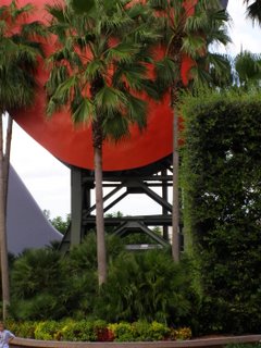
16) Whack the Wand
I’ve yet to receive a single e-mail, even from Imagineers themselves, defending the wand. No one likes it. It’s an eyesore. I once read that an Imagineer claimed the wand and sign helped “better identify” Epcot. Ummm … a 180-foot-tall, unique-in-the-world geosphere doesn’t do that? If recent rumors are true, the wand might actually be on its way out. A move like that … well, the thought alone leaves you thinking that maybe, just maybe, there is a little imagination left in the world!

Thursday, November 02, 2006

Rethinking Mission: Space


Especially for those of you who have accused me of "fuddy-duddiness" and incessant complaining about EPC-- er, Epcot, this will come as a total shock. I know it shocked me.

After my absolutely scathing indictment of Mission: Space several months ago, I ventured on board again during my recent vacation to Walt Disney World. Damn it all ... I kind of liked it.

Make no mistake: I absolutely hold to many of my original criticisms. The ride is absolutely not suitable for all guests -- in fact, I'd wager that the vast majority of Epcot visitors would leave the ride highly agitated. It is an intense experience with sensations that would best be described as disturbing to most non-teenagers and questionable for those who are younger. It is most decidedly not the kind of ride Walt Disney had in mind when he wanted to make a theme-park experience for the whole family, or what Imagineers had in mind when they created EPCOT Center.

And yet ...

I rode it four times in six days, and I learned how to enjoy it. It still left me queasy and slightly afraid for my own well-being. Even the "less intense" version is a borderline terrifying ordeal, one to which I would suggest most people to subject themselves.

But for those who can stomach it, there is some genuine awe on Mission: Space. I actually felt, for a few moments, that I was not at a theme park in Florida but on board a spacecraft headed to Mars. I felt the weightlessness, felt the extreme g-forces, felt the rush of excitement that comes with pushing the limits of what I ever thought I would allow myself to do.

(As a side note, it's a telling sign of the public's general rejection of this expensive addition that on a crowded Saturday afternoon the wait time for Mission: Space was listed as 10 minutes -- and in actuality was about three minutes -- while the 24-year-old Listen to the Land boat ride boasted a 35-minute-long queue.)

There's something almost addictive about Mission: Space, once you accept that it's a thrill ride through and through.

It's still very much the case that I learned nothing about space travel (and came away, after four rides, confused whether we're supposed to be going to Mars or, as the ride seems to indicate, just training for that). I'm not even sure if astronauts-in-training actually experience things like this. It left me with no sense of discovery or excitement other than a pure adrenaline rush.

At any other theme park, Mission: Space would be an extraordinary, noteworthy accomplishment, but at Epcot it remains just another example of trying to appeal to adrenaline-addicted teenagers.

Nonetheless ... I've softened just a tiny bit. Mission: Space is still all wrong for Epcot, but it is a heck of a ride.

Wednesday, November 01, 2006

Sea Base Memories


Here's a wonderful look back at The Living Seas as it was in 1989, just a few years after opening.

Listen to the kids responding eagerly to the sights they encounter while on the Sea Cabs. Notice how much more interesting and enticing the presentation in the Sea Base is because it's being done by a real person. (And ask yourself, could Disney's cast members pull off such a good performance today?!)

Thanks to YouTube and videocameras, this is a great little time capsule that hints at just how cool The Living Seas was when it still seemed fresh and new and Disney hadn't turned its back on the pavilion.

The Way-Back Machine


"The Perky Pickle" blog contains a fun, bouncy look back at the original EPCOT Center with nary a hint of my cynicism or melancholy!

I encourage everyone to hop on over to the Pickle for some fantastic vintage photos and a different perspective on the EPCOT Center we all knew and miss so much! (This link will take you to Day 5 of the five-day series; earlier days can be found along the right-hand side of the blogpage.)

EPCOT Center: Disney's Taurus?


Last week’s announcement that Ford was finally pulling the plug on production of the car that was once its top seller, the Taurus, elicited enormous press coverage. Among the obituaries for this once-innovative automobile was a beautifully written editorial in USA Today that remarked on Ford’s “well-developed talent for turning success into failure.”

The death knell for the Taurus had a familiar ring all throughout the news media, but particularly in the USA Today piece. Here’s another quote: “They pin their hopes on their next new thing that will have to survive in a ruthlessly competitive market.”

Sound familiar?

The outcry of disappointment in Ford’s decision bears a striking resemblance to the way The Walt Disney Company has treated its theme parks, particularly EPCOT Center. Rather than upgrade, innovate and put serious thinking into saving and updating its most noteworthy car in decades, Ford decided to throw in the towel, claiming that the car-buying public wanted SUVs and trucks instead of sedans. Not looking back, Ford barely acknowledged how groundbreaking and revolutionary its Taurus was, and how it helped rescue the company from near ruin in the mid-1980s.

Similarly, Disney has claimed that years of study reveal its consumers want Disney characters, thrill rides and basic amusement-park entertainment, and it filled EPCOT Center with those things, ultimately acknowledging that the park had strayed so far from its roots that its original name would be dropped in favor of the simpler “Epcot” – a name, we all know, that means absolutely nothing.

Like Ford, Disney turned its back on its own management in these decisions. Innovative, risk-taking managers had decided to chart a new course, one that would be a gamble but could ultimately open new doors of opportunity for the respective company. They relied on their own expertise, experience and instinct to determine what their company should offer – not simply on focus groups and market-research surveys. In Ford’s case, the result was a home-run, a car that proved to be both enormously popular and influential. In Disney’s case, the result was a solid double, a theme park that tried new things and, by most accounts, succeeded quite well.

Consumers ultimately tired of these innovative offerings, more as a result of a lack of refinements and redesigns in each than due to a flaw in the basic offering. As consumers began looking elsewhere, neither Ford nor Disney responded by upgrading and improving their offerings – in each case, the company essentially let the product turn stagnant. After offering something truly new and exciting, both Ford and Disney suddenly lost the desire to continue trying new things. The innovation stopped.

Ford and Disney turned their attention to what the public claimed it wanted – SUVs in one case, thrill rides in another. Not surprisingly, it turned out that, by and large, the public didn’t want those things from these companies; others did them better. (Witness Ford’s devastating $5.8-billion quarterly loss and Disney’s debacles at California Adventure, the Walt Disney Studios Paris and Hong Kong Disneyland.)

The Taurus and EPCOT Center were both products of an odd era in corporate American history, one in which decades of bold innovation were about to be laid to waste by marketing-driven business decisions. In the Taurus and EPCOT, two American icons offered one final showcase of ingenuity and creativity. Beginning in the early 1990s, each company would be driven not by the desire to create the best and most innovative products, but by pleasing shareholders with the best possible financial performance.

In Ford’s case, we’ve seen what happens when a company is ruled solely by the bottom line and drops innovation in favor of giving the public what it wants; in Disney’s, the final outcome remains to be seen.